Digital Bank Transfers

Solving a usability issue in a banking mobile app after discovering a significant drop-off rate in the transfers funnel.
Brand name and sensitive info have been hidden in accordance with a non-disclosure agreement.
My Role
As the UX/UI designer on a new digital banking app team, one of my responsibilities was identifying user experience issues and continuously improving the app's usability.
Problem
When I checked our transfel funnels, I found a significant drop-off rate in the the transfer flows, 35% from first two screens.
The Main Goal
Increase the conversion rate in the transfer funnels.
The Process
I started with a quick evaluation of the targeted flows, making assumptions about where the issues were. I'd usually check a session recording tool for a quick read on what's happening, but we didn't have one installed.
The evaluation surfaced obvious issues in:
- ❌Information architecture for the transfer types
- ❌UX writing
- ❌Visual hierarchy
To back these findings up, I ran usability sessions with a quick interview after each one to collect users' thoughts and expectations. This validated our assumptions and defined the pain points and opportunities in the flow.
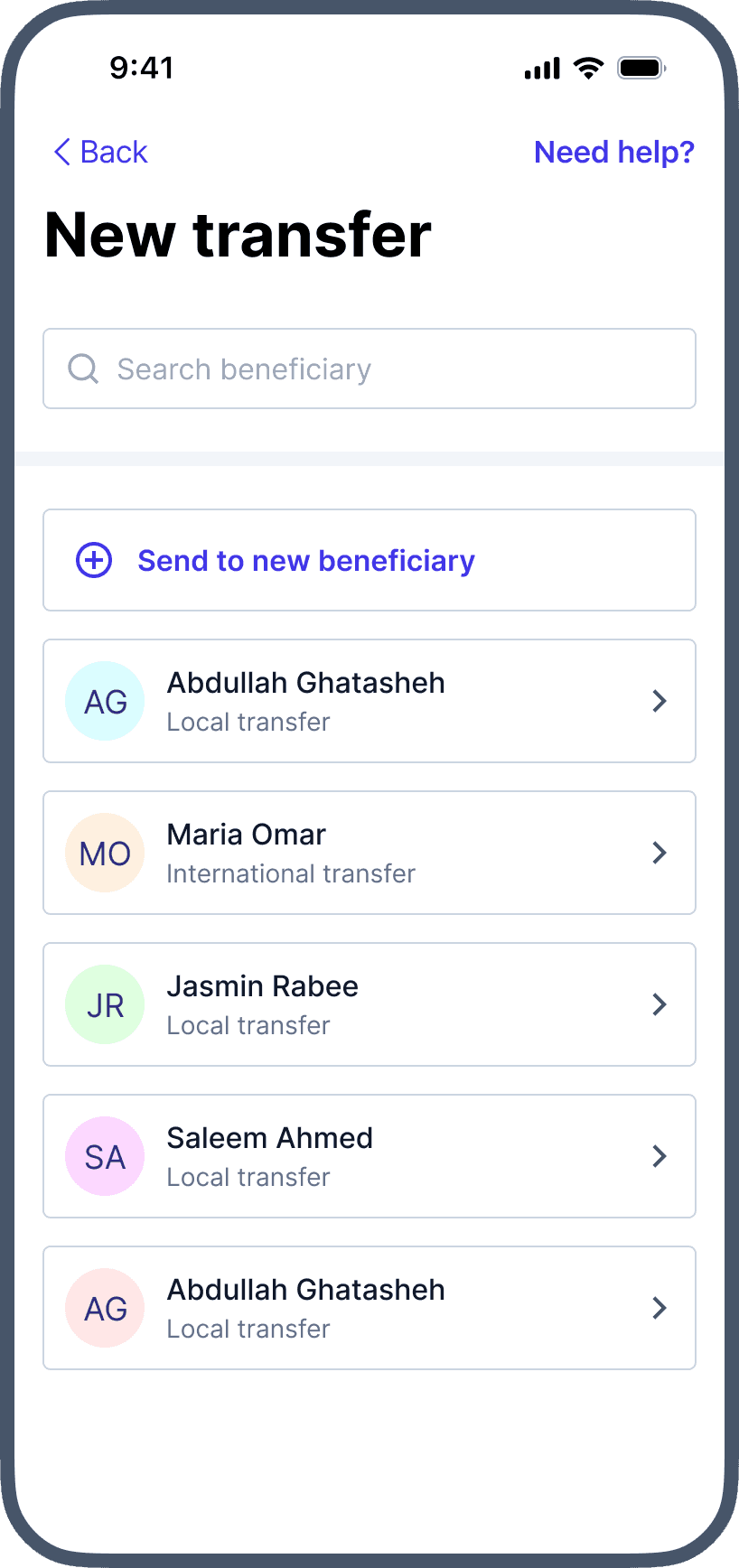
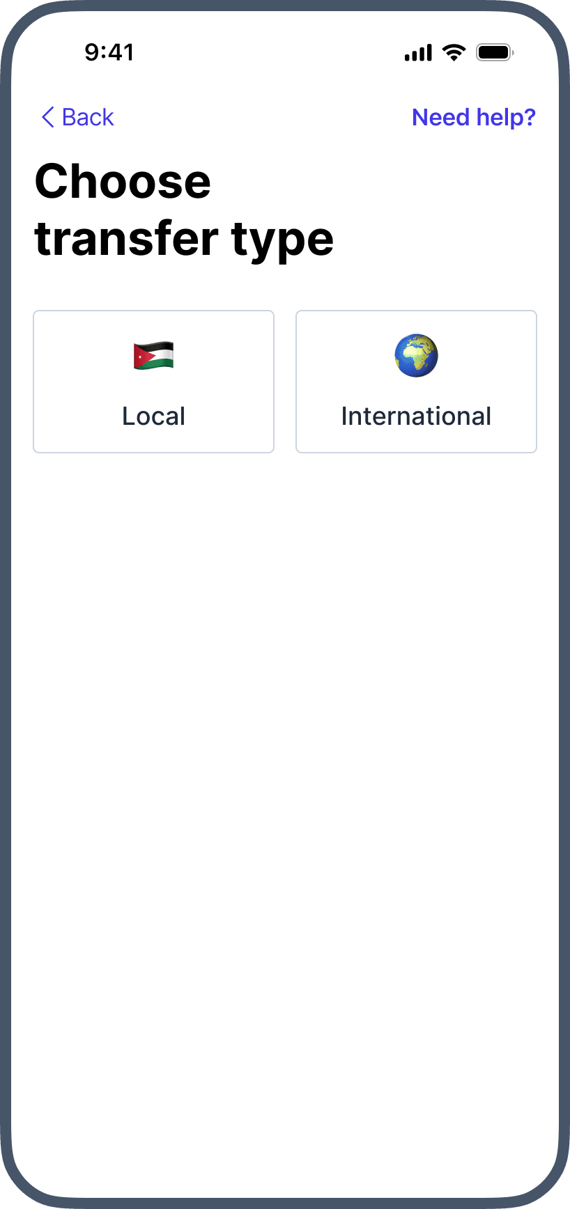
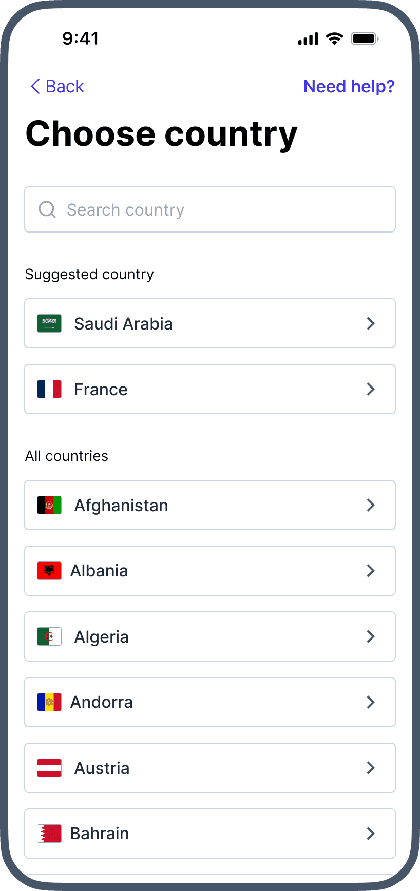
With the pain points, opportunities and user expectations defined, I ran a brainstorming session with members from different teams. We then visualized the solutions as low-fidelity wireframes and high-fidelity prototypes for testing.
Solution
Based on what we learned, the transfer experience was redesigned around four changes.
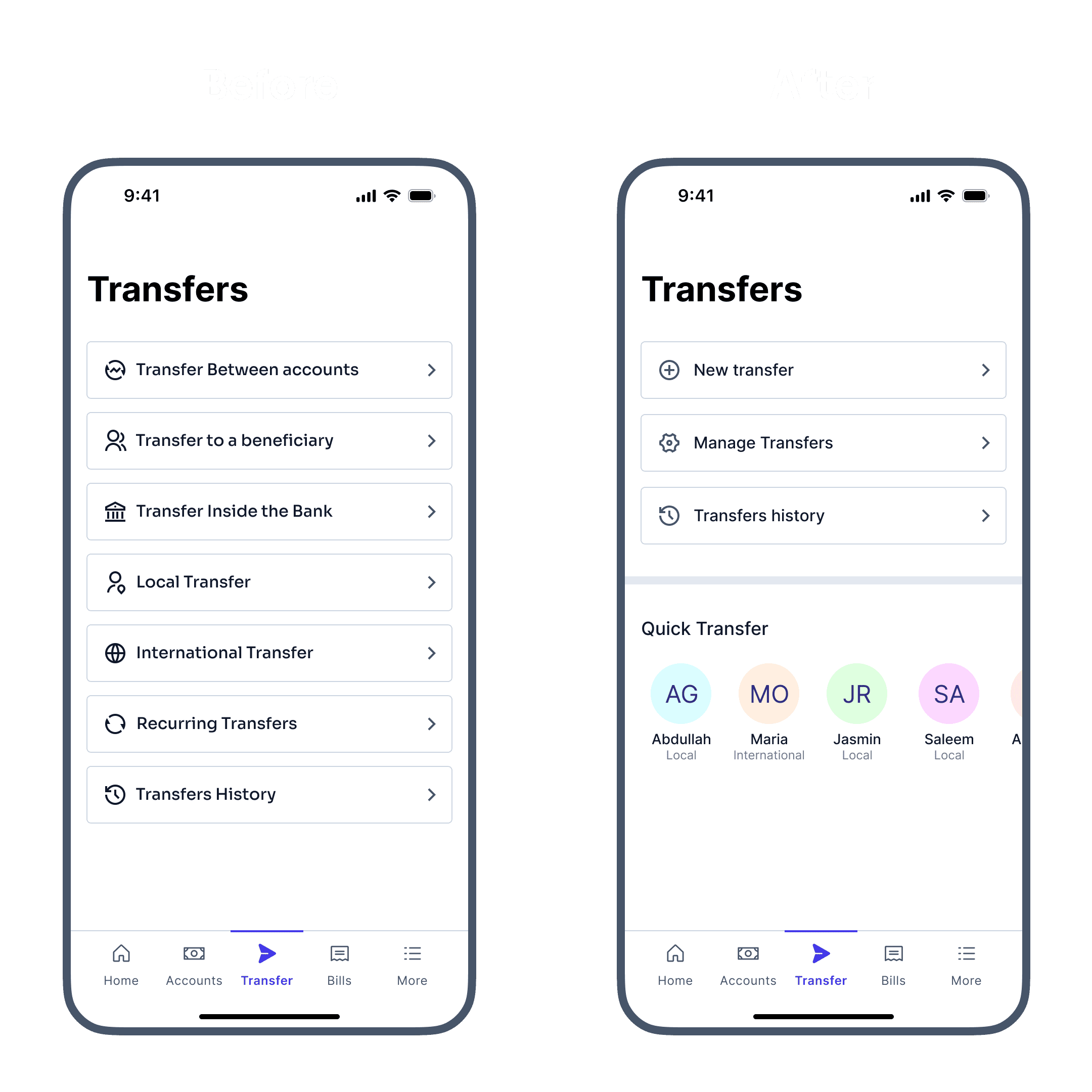
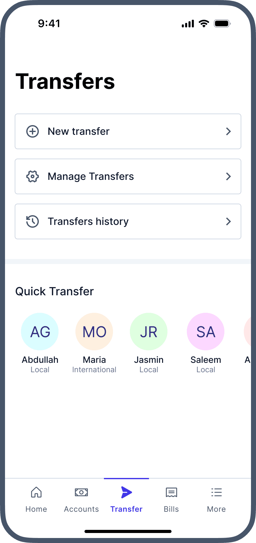
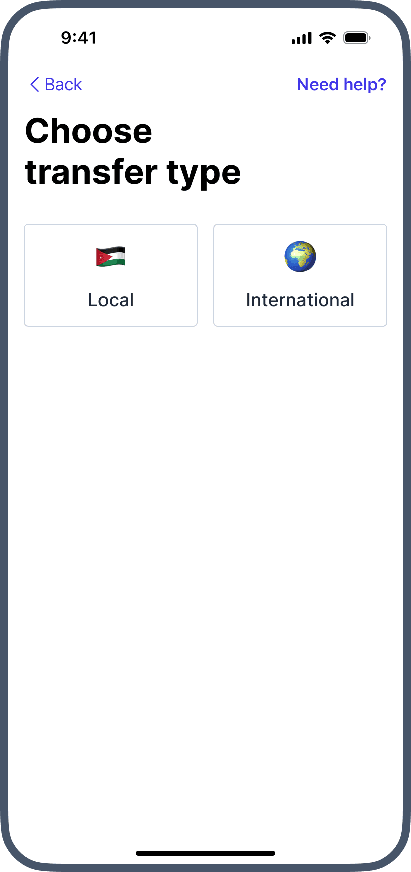
All Transfers Into One
We merged all transfer types into one transfer action. Transfers between the user's own accounts were removed from the transfers screen, since the data showed most users made them from the accounts screen.
One Task Per Step
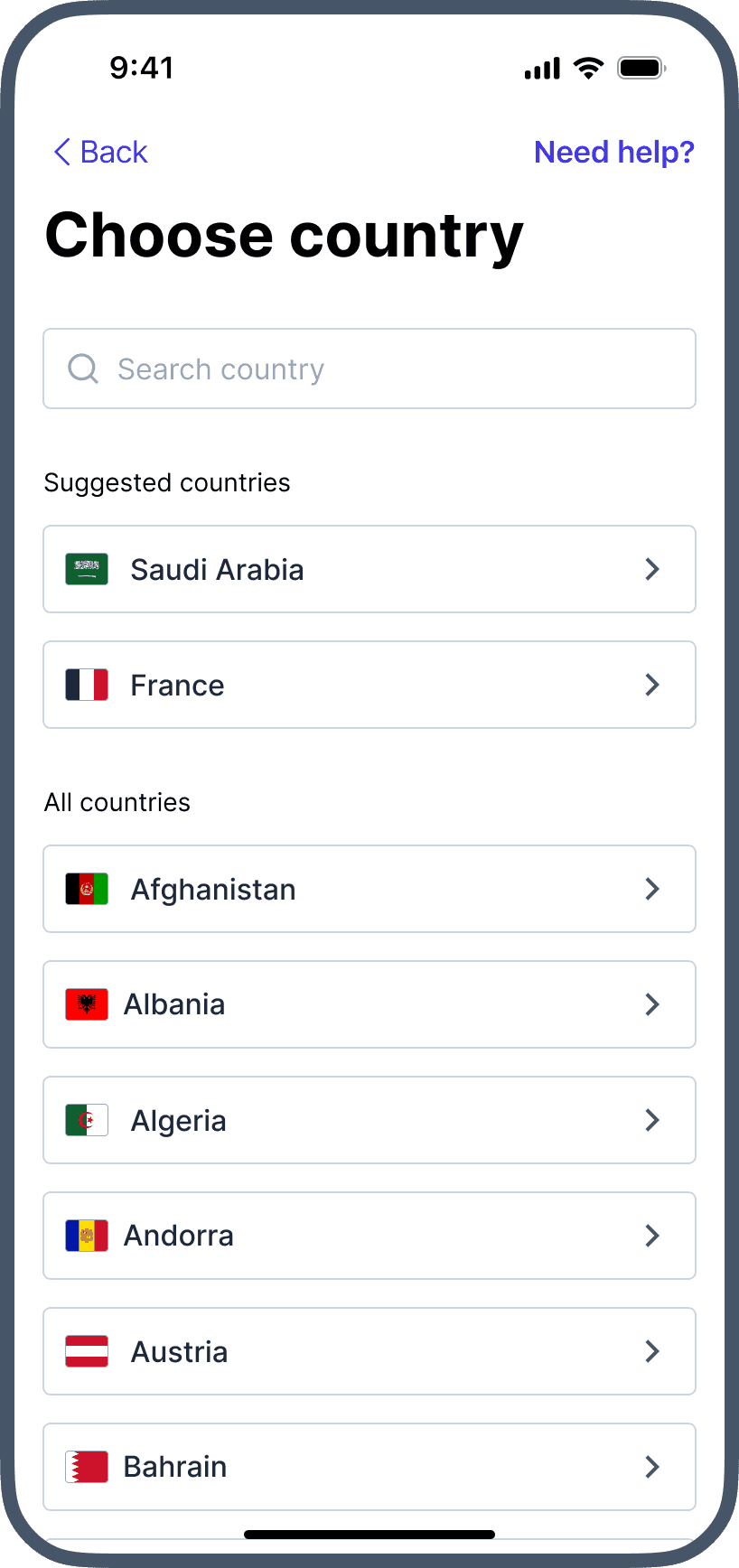
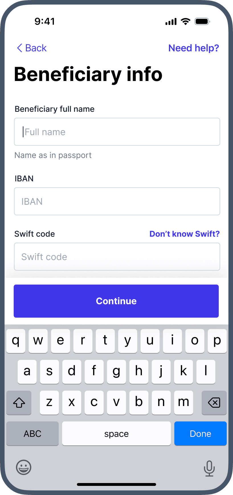
With all transfers merged, we used progressive disclosure to divide the flow into steps, so users focus on one task per screen. The first step asks for the destination country, so users only see the fields relevant to a local or international transfer, since some countries, like the USA, don't use IBAN.
Make It Clear
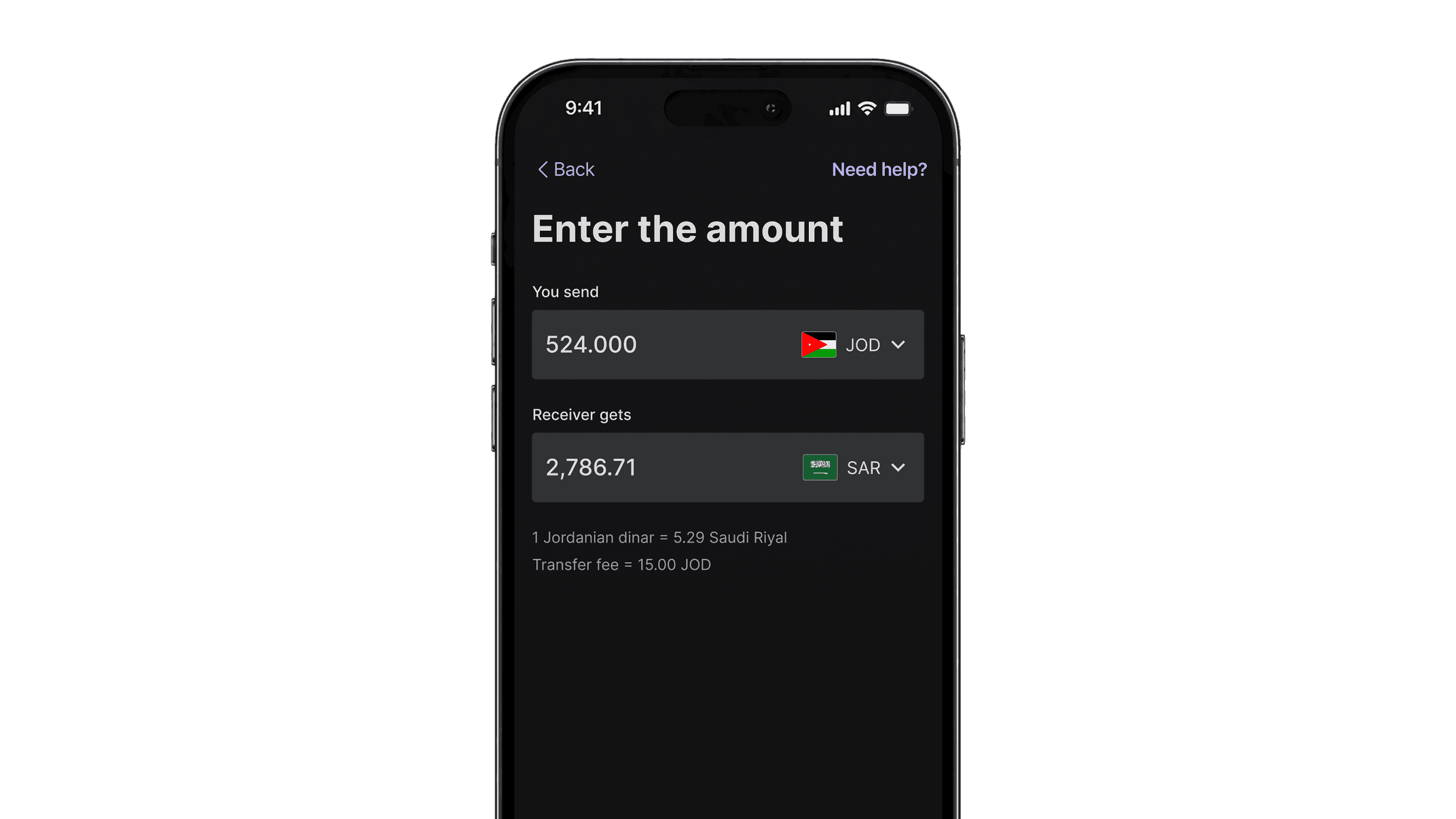
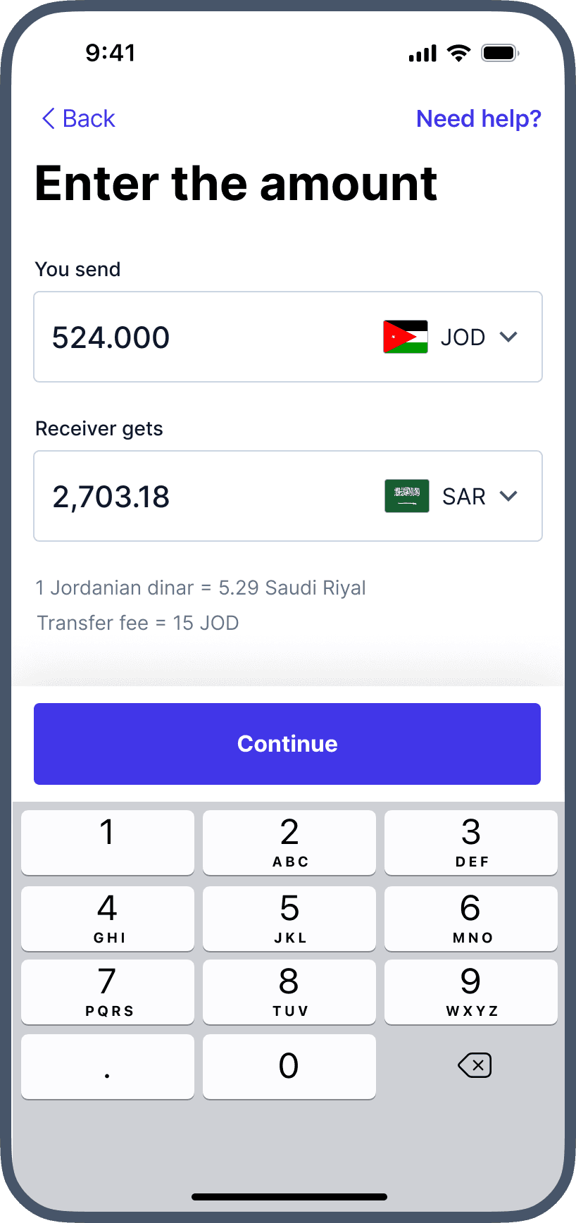
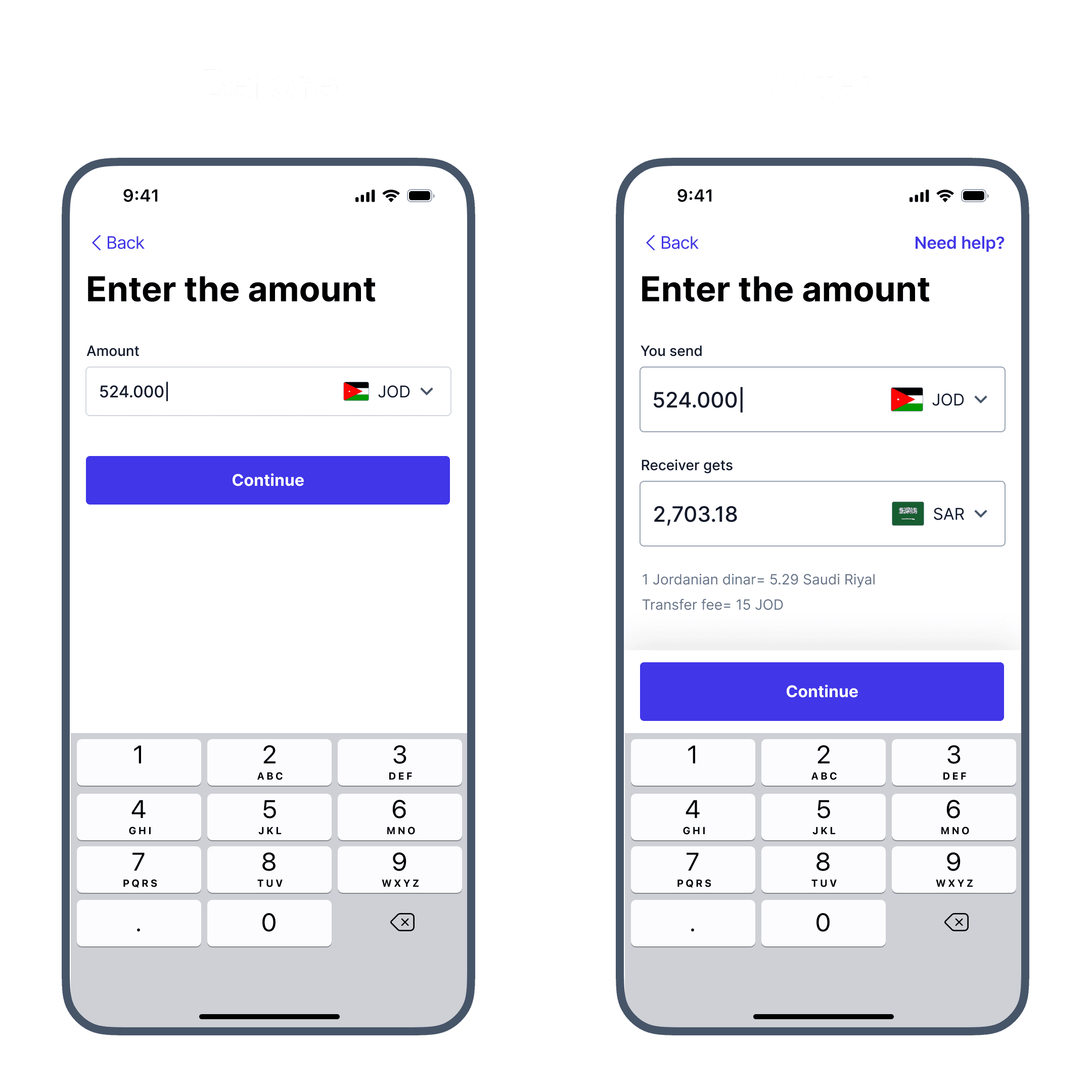
For international and different-currency transfers, users can enter either the amount to send or the amount the receiver gets, so there are no hidden fees. Before, users had to reach the review screen to see how much would be deducted from their account.
A More Prominent Save Beneficiary
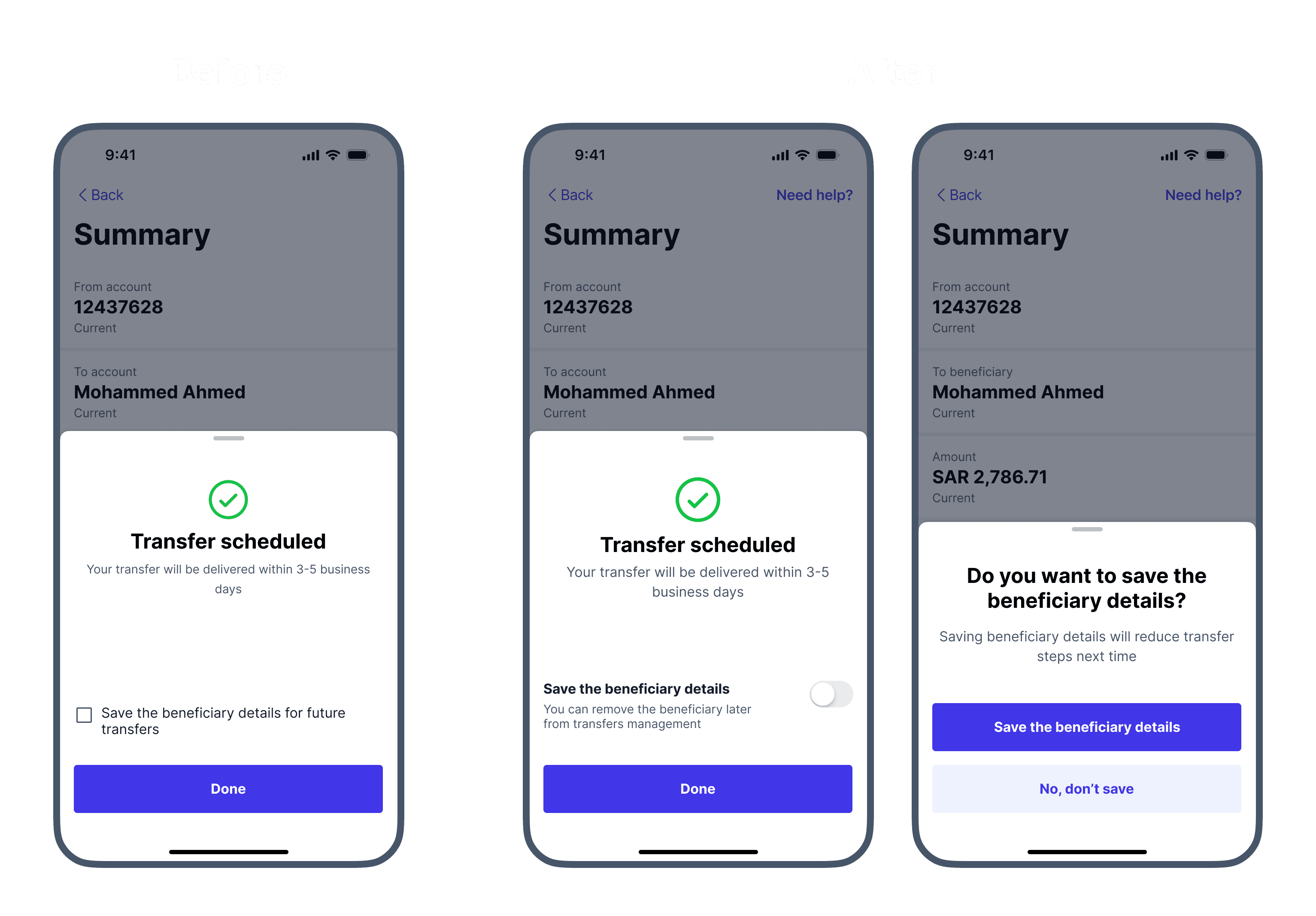
We redesigned the save beneficiary checkbox as a more prominent toggle. If users miss it, a bottom sheet reminds them to save the beneficiary after the transfer is done.
Impact
We validated the redesign in usability testing before release, then tracked the transfer funnels after launch to measure its impact.
- 🚀92% task success rate and 25% faster time on task across all transfer types in usability testing.
- 🚀18% higher conversion in the international transfers funnel within the first month after release.
- 🚀22% increase in saved beneficiaries within the first month after release.
Read Next
Explore more case studies and projects.